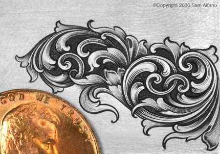
Of all the skills that the engraver should master, shading could be considered one of the most difficult. Why? Because fineline shading requires the highest degree of graver control, since the cutting is extremely delicate. Consistent spacing is critical, and any irregularities stand out like a sore thumb. It goes without saying that the best shaders in the engraving world have developed an instinct for shading an endless variety leaves, stems, and scrolls. They can quickly eye a portion of the design and know exactly how to shade it to perfection. This skill takes time to develop, and is one of the most difficult things to teach.
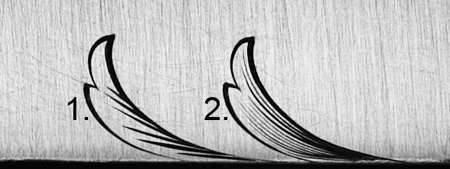
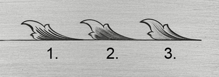
The beginner should start by shading classic, spiraling scrollwork, while studying the works of other engravers to see how they shade similar elements, and cut his or hers accordingly. While the leafier and more random Arabesque designs are popular, the student should master scroll shading before progressing to wider, leafier designs which are considerably more difficult to shade.
The goal of fineline shading is to achieve a three-dimensional look on a flat surface. With good shading, intertwining stems and leaves give the illusion of overlapping, with dark and light areas indicating high and low areas. The shaded areas should have absolutely smooth transitions from light to grey to black. This can only be accomplished with perfect control of the graver and good instincts on how each leaf should be handled.
When cutting fine shading, I use a 120° graver with a 45° face and 15° heel. Since the 120 incises a much wider V than a square (90°) graver, you might think it would be unsuitable for the ultra fine cuts that fine shading demands. This is definitely not the case. The 120° tool works exceptionally well for the finest of shade cuts.
One of the most important things to learn about shading is how to start with a micro-thin line and get wider and deeper as the cut progresses. To achieve an extremely fine line at the beginning of the cut, the graver's heel scoots across the surface of the metal a small ways before it enters the metal and produces a curled chip. This very thin beginning to the shade line is extremely important to successful shading, and should be practiced until perfected.
As the cut progresses, the line will gradually get wider and converge with adjacent lines to produce a dark area at the base of a leaf or an overlapping stem. With an extremely fine start, consistent spacing, and a progressive widening of the cut which converges with adjacent cuts, the overall effect with be smooth transition from light to grey to black. This light to grey to black transition is the hallmark of fine shading.
While more lines generally look better and produce smoother results than a few lines, avoid the temptation to fill areas with with too many cuts. Shading certain elements with restraint will be the best approach, because it's not always what you engrave that makes you a good engraver, but what you don't engrave. |